 |
| No hidden meanings in these books... |
Sometimes they even chose titles. Why? Because they've been at it and they (hopefully) know what they're doing. I've seen some author chosen covers and they are not good. For example, Vanessa Sleeping Naked is Green. But I like it. It's funny. It represents the book well, which is also funny. Writers write and publishers market. So go marketing team, you sold me a book. See, not all marketing is bad. Farquharson hated the cover of her book,
Political books often feature a photo of the author on the cover. That's because publishers know that the readers who are going to pick that book up are doing it because they recognize the author and may want to read what they have to say. Many of those authors may not have chosen to put themselves on the covers (or maybe they would. Ugh, politicians).
 |
| About Beck's ego, not Washington |
In some cases a cover can help give you an idea of the writing quality and how much faith a publisher has in the book to begin with. I won't name any names because I'm not out to insult anyone, but some covers just look thrown together. If little effort was put into creating an intriguing cover, it may be that the publisher was less excited about it. All authors will want a high-quality, expensive-looking cover, but sometimes the books just don't merit one. Don't worry too much about this though when shopping, because of the reasons below.
2. Demographics:
Publishers know their audience. They know what age, gender, and interests they should target in their readers and will pick a cover that appeals to those people. For example, when I look for a kids' book, I don't want anything that is too strongly male or female. I like stories to be fantastical, but not strictly fantasy. I also like things kind of creepy, but not scary. No surprise that I picked up Gustav Gloom, The Girl who Circumnavigated, and also The Tell-Tale Start. All of these books have gender neutral* covers and are a little mysterious-looking. Loved them. Harry Potter? Yep, you fit the bill.
I also hate reading books about young love, lust, or anything in between. It's a no-brainer that I won't be reading Sarah Dessen this summer, as all of her covers are marketed to a female audience and have all kinds of hearts and frills on the covers. I don't like violence either, so I won't be reading Department 19. That doesn't mean these are bad books, it just means they were not marketed to my interests.
 |
| Personal copy #127 |
Sometimes a book gets a new cover to appeal to a newer audience. Ursula Le Guin's books got new covers that appeal to a slightly younger audience than they did originally. That makes sense because a YA reader could enjoy them just as much as a reader of adult fantasy. Classic books often get neat classic, old-timey looking covers, to show off their timelessness. (How many editions of Jane Eyre do I own, just because I loved the covers? I'll never tell.)
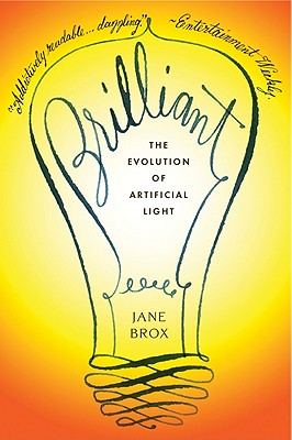 |
| Yellow and about lights! Perfect! |
3. Because you can:
You should pick up a book and be dazzled from the very start, meaning the cover. You should be excited to open the book and get to reading. Something about it should grab you and hold you. A great cover is the first step to that. Plus, you know best what looks prettiest in your home library. I have a preference for yellow and orange books, myself. No reason. Just do.
*By gender neutral I mean that the book doesn't try to be a "boy book" or a "girl book." You know, no fairies, gun, sports, or cleavage. Nothing that screams "I THINK GENDER IS IMPORTANT AND IN ORDER TO BE A PROPER GIRL/BOY YOU SHOULD LOVE THIS BOOK." It does not mean that there are no male or female characters on the cover.
What a fun post! This is a really interesting perspective, as we're always told that we should let the book speak for itself. However, it's nearly impossible not to let the cover be an influence. So often I marvel at the books my husband picks up at bookstores, because I would never in a million years flip through them based on the cover alone. He's very much a science fiction guy, and I am not. The kinds of covers I'm drawn to are usually more colorful and lively. I tend to read a lot of cookbooks, and the cover, page design, and photos make a big difference in terms of how connected I feel to the food or inspired I feel to make it. You raise some good points about why we shouldn't shy away from our design preferences!
ReplyDelete